Il tempo vola e la moda lo precede, quindi iniziano a vedersi in giro per i fashion blog le palette Pantone dei colori che faranno tendenza il prossimo autunno inverno... leviamoci il pensiero :)
(ps la mia ammirazione a chi continua a inventarsi nuovi colori e i loro nomi... cioccolato decadente? uva gotica? li lascio in inglese vah)
1. Divertitevi
L'esplorazione del sé attiva e giocosa. Prendetevi il tempo per divertirvi, fare cose nuove ed essere sempre in cambiamento.
1. have fun
The exploration of 'self' through playfulness, and activity. Making time to have fun, experiment and be ever changing.
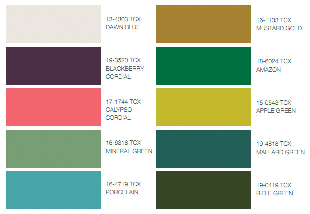
Colors: dawn blue, blackberry cordial, calypso cordial, mineral green, porcelain, mustard gold, amazon, apple green, mallard green, rifle green
2. Fuggire (dalla città?)
Una dimensione rustica e senza fronzoli che mira alla femminilità con un fascino naturale, rustico e delicato, selvaggio e prezioso nel contempo
2.escape
A rough, raw dimension that hints at femininity with natural charm, rustic yet delicate, wild yet precious.
 Colors: cream tan, copper, burlwood, chateau rose, desert sand, beet red, incense, whitecap gray, lead, bracken
Una dimensione rustica e senza fronzoli che mira alla femminilità con un fascino naturale, rustico e delicato, selvaggio e prezioso nel contempo
2.escape
A rough, raw dimension that hints at femininity with natural charm, rustic yet delicate, wild yet precious.
3. Moderne e creative
Prendetevi il tempo per esplorare la propria creatività e nuove idee, con attività artistiche come la pittura, o il fai da te, ma reinventandoli in modo futuristico
3. adventuress
Making time to explore our own creativity and explore new ideas, looking at art activities such as painting, printing and crafts, but reinventing them in a futuristic way.

4. Tempo di brillare
E' il momento di cercare negli elementi decorativi moderni per trovare squisite bellezze e perfezione. Tonalità che creano intriganti atmosfere drammatiche, di desiderio e realizzazioni per ritrovare il proprio status al cospetto del mondo moderno.
4.Time to shine
A time to find exquisite beauty and perfection by looking at decorative form and modern adornment. Creating drama and intrigue, desire and satisfaction. Regaining our status to face the modern world.


Fall 2011 − The Art of Color − Sensible and Spirited
 Taking cues from the great masters, sepia tones of old Hollywood, Chinese opera, cityscapes and countryside, designers are paying close attention to texture, contrast and color for fall 2011 – pairing menswear with feminine twists, warm prints with cool metals, incorporating both old and new influences, and creating an intriguing balance between colors.
Taking cues from the great masters, sepia tones of old Hollywood, Chinese opera, cityscapes and countryside, designers are paying close attention to texture, contrast and color for fall 2011 – pairing menswear with feminine twists, warm prints with cool metals, incorporating both old and new influences, and creating an intriguing balance between colors.“Designers take a painterly approach to fall 2011 by artfully combining bright colors with staple neutrals, reminiscent of how an artist would construct a stunning work of art,” said Leatrice Eiseman, executive director of the Pantone Color Institute®. “Much like a painter's masterpiece, there is a certain romance to this season's palette.”
Bamboo, a surprising fall hue, brings a warm, exotic flavor to the season. Like a filtered sunset on the waning days of fall, Bamboo is a standout yellow with a subtle green undertone. This dappled shade pairs dramatically with several of the top 10, including Phlox, Teal and Honeysuckle.
Radiant Emberglow, a traditional autumnal tone, emanates the warmth of a glowing fire – the perfect panacea to the crisp air of fall. Combine Emberglow with Coffee Liqueúr for a classic look, or with Honeysuckle for something a bit more retro. Add a spark with shoes or a handbag in Emberglow, or perhaps a patterned scarf combining purpled Phlox or Deep Teal.
Offering a sense of continuity from spring, dynamic Honeysuckle adds a bold punctuation point. This playful, reddish pink works with any other color in the palette, especially fall staples like Coffee Liqueúr and Nougat. To add some intensity, pair it with complementary Bamboo. Flirtatious and festive, Honeysuckle produces a healthy glow – great for cosmetics and holiday soirees.
Phlox, a magical, deep purple with a hint of mystery, is an outstanding statement when worn on its own. Add Phlox to this season's neutrals to create a bit of drama, or combine it with Cedar, Deep Teal or Coffee Liqueúr for something extraordinary. To add even more excitement, pair Phlox with Honeysuckle or Bamboo against a Cedar background – a combination inspired by Mother Nature.
Evoking the freshness of a cool mist in a dark forest, Cedar is a versatile, mid-tone neutral green. It is a natural with Deep Teal, and sophisticated and timeless with Phlox or Orchid Hush. Deep Teal, a strong, blue-toned green, suggests ocean depths and the color of the sky as daylight descends into darkness. A great standard when used with Cedar, its color-wheel neighbor, Deep Teal is also a unique counterpoint to Honeysuckle.
Consumers continue to add stability to their wardrobes with neutrals. Rich, decadentCoffee Liqueúr brings a sense of elegance to fall, and is a savory alternative to basic black. A deliciously warm camel tan, Nougat is tastefully embellished by Phlox, Emberglow or Honeysuckle. Orchid Hush, a unique tone of gray with complex orchid undertones, blends well with any other color in the palette. Quarry,a reliable medium gray, remains, as always, a practical, dependable staple.
For over 17 years, Pantone, the global authority on color, has surveyed the designers of New York Fashion Week and beyond to bring you the season's most important color trends. This report previews the most prominent hues for fall 2011.
Palettes di colori meravigliose!!, ma non è nemmeno ancora arrivata l'estate e se penso già all'autunno mi deprime :(.
RispondiElimina:********
a entrambe piace di più pensare alla primavera a dicembre anziché all'autunno in maggio heeheh :***
RispondiElimina